We’re surrounded by billboards everywhere we go, and usually they’re so big, whether we like it or not, we can’t escape them. They’ve always been a part of our lives, and they’re not going anywhere, so if we have to look at them every time we’re stuck in traffic or simply crossing the road, they might as well be witty and entertaining. These companies took advertising to the next level with these extraordinary billboards.
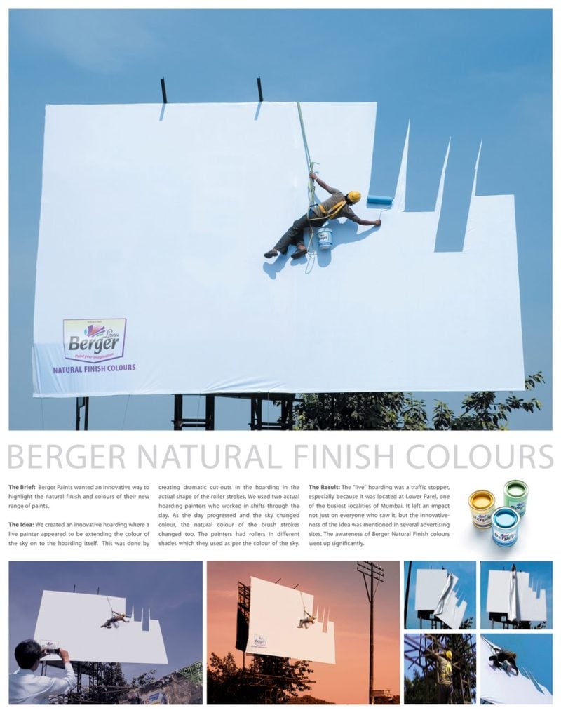
Anando Milk
When we grow up, our parents tell us that drinking our milk will make us big and strong. That’s the message Anando Milk, a local milk company, was going for in this one-of-a-kind billboard. Why would milk require advertising, you might wonder? While in the past milk was our regular choice of drink for breakfast, lunch and dinner, today children have plenty of beverages, such as juices and energy drinks, that replace the good old milk.
The India-based company came up with a creative way to make milk cool again: Anando milk will make you strong enough to move a building. If this isn’t considered good advertising, I don’t know what does, and to be honest – we’re convinced; we’re off to pour another glass of milk.
Powerhouse Gym
Once, billboards appeared in the form of simple, straight-forward messages written on cardboard and posted on the side of the road. However, the advertisement world is dynamic, and businesses need to constantly renovate and come up with new advertising strategies in order to keep up the pace. The famous Powerhouse Gym started its way in Michigan, back in the seventies, and as the chain gained popularity, their advertisement techniques progressed.

This brilliant billboard demonstrates how strong you will get if you work out at Powerhouse Gym – so strong, you’ll be able to maneuver two cranes all by yourself. Okay, this is obviously an exaggeration – but when it comes to advertising – you can’t oversell anything, and exaggeration works. Today, integrating the environment as part of the advertisement has become a common advertising method, and if you ask us, it works.
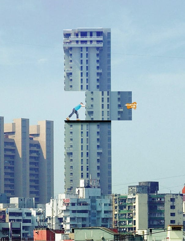
Koleston Naturals
Koleston Naturals utilize natural light to promote their product – can you think of anything more sophisticated? Using our nature’s beauty to promote the product that’s supposed to look natural, and is made of natural ingredients, is one of the most creative advertising campaigns we’ve seen yet.
They couldn’t have asked for a better demonstration of hail color that looks natural, since their product all-natural. The billboards are placed on a roadside cliff overlooking the ocean, and nature does most of the work for them. With this kind of sophistication, you don’t need to use many words (or any at all) to make an impact; in this case, a billboard is worth a thousand words.
Calgary International Film Festival
It only makes sense that a billboard advertising a film festival would utilize the 3D technique. Advertisers know that stirring emotions is key for good advertising, and it’s particularly relevant when advertising a film festival. The Calgary International Film Festival posted different versions of this sign, where people are shown sobbing or crying, using a 3D effect of tears.
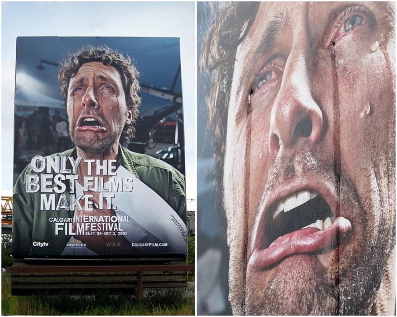
With the slogan, “only the best films make it” (demonstrated by the emotion-filled image), the Calgary Film Festival announces loud and clear they will settle for nothing but the absolute best – and the best films deserve the best advertisements. If this doesn’t make people interested in the festival, I don’t know what would.
Lego
We admit Nationwide Insurance and McDonald’s took us by surprise with their creativity, but we’d expect nothing less from Lego, the company that takes pride in their innovation skills. As children, playing with Lego allowed us to create our own imaginary world and alternative realities where we could be anything we wanted.

With Lego, the sky is the limit, and that’s why the word “imagine” is more than enough to convey their message, and the rest is up to your imagination. A company that’s trying to sell the dream that nothing is impossible, can’t do so without creative, unconventional signs – this Lego billboard, portraying an imaginary world of monsters inside our reality – certainly does the job and fills the word “imagine” with meaning.
Max Factor
As women, makeup can be our best friend, but it can also be our enemy, for instance when our mascara runs down; that’s why this billboard is so relatable and realistic. How realistic, you ask? The mascara on the billboard, just like the one on our eyelashes, is sensitive to rain. To be honest, this Max Factor mascara rain-sensitive billboard might be too sophisticated for us to understand.
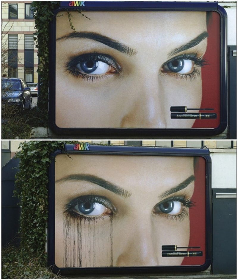
We admire the creativity behind this, after all, it’s not often that you see a sign with running mascara, but we thought they were supposed to market their product as water-proof, and this seems to be doing the opposite. Perhaps we’re not witty enough to understand the logic behind this, or perhaps this billboard does require some text in addition to the cool image. Either way, it’s eye-catching.
Science World
If you’re no yet familiar with it, Science World, the Vancouver-based science center, is a non-profit organization that operates a museum with the sole purpose of teaching children (and adults) about science. You’d think that people who know about science don’t necessarily know a lot about advertising, but you’d be wrong! The people over at Science World found a way to utilize science for their benefit and make it seem cool.

Did you know we grow 121 feet of hair every day? Neither did we, and that’s a very cool fact, but if their sign wasn’t this intriguing, most people would probably pass by it without giving it a second glance or bothering to read the text, because that’s how we’re programmed. Thanks to this creative sign, we’ve learned something new.
Xenon Mini Cooper
It’s not the bat signal, those are the lights of the new Xenon Mini Cooper. Let there be light, let there be Xenon, same same but different – using biblical phrases is one of the oldest tricks in the book of marketing, since comparing your product to something heavenly can’t do any harm.

Of course, having the same advertisement without the shooting lights wouldn’t have the same impact. These days, we’re used to seeing so many ads everywhere we go, and so every ad should be innovative and bring something new to the table, otherwise, we simply won’t notice them.
Craftsman
Once again, advertisers have learned that actions speak louder than words, and not many words are needed when the message comes across loud and clear through the right word – trust. With the Craftsman wrench, you can trust your hands.

Sure, you can buy a wrench from any other store, and it’ll probably work just fine, but the Craftsman wrench is the only one that allows you to trust in your hands, and they’re the only store who went the extra mile to market their wrench, which adds a few points, if you ask me.
McDonald’s
What’s the time? It’s McDonald’s o’clock. It doesn’t matter what time it is, as it’s always a good time for McDonald’s, or so this billboard suggests. The light is always on at McDonald’s. We already established that McDonald’s has some of the best billboards, but you haven’t seen the half of it.
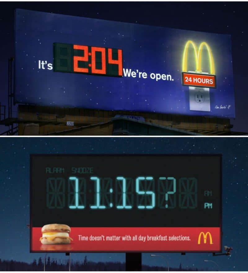
We’re not big fans of billboard advertisements, but when so much thought and creativity are put into them, it certainly makes it more appealing. However, we’re concerned that some of these signs are so cool, they might be too distracting for drivers and passers-by.
Panasonic
Did we mention we love advertisements that interact with their environment? We probably did, but if you’re not yet convinced, here’s another great example. Panasonic wanted to market their new nose-hair trimmer, which isn’t an easy product to market, to say the least, since there’s nothing sensuous, interesting or particularly fun about it.
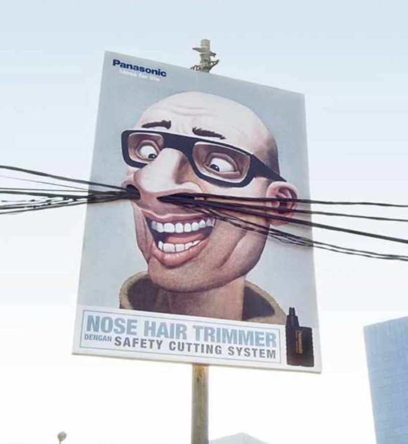
That’s why they did what any sensible advertiser would, and showed you exactly why you need this nose-hair trimmer – unless you want to have electric wires coming out of your nose, you better hurry to the store. Using the electric wires also plays on the safety dimension of the product by the electronics company.
Formula Toothcare
The trend of utilizing the environment as part of the marketing strategy didn’t pass over Formula, who came up with one of the best billboards we’ve seen yet. The message is clear as day – this is how strong your teeth will get if you use Formula toothpaste regularly – nothing very creative about that, but the best part about the advertisement is how real and lifelike it looks.

The marketing company of Formula did a great job with the execution of this billboard, as well as the model. If you ask us, this advertisement makes us want to give Formula a chance; if their product is as good as their marketing, they must know what they’re doing.
Law and Order
NBC’s beloved legal drama Law and Order is on air for such a long time, it’s been a regular part of our lives ever since we can remember. A show that’s running for years on end needs to refresh their image every now and then, and while the episodes don’t change much, their marketing has certainly progressed over the years.

This billboard, portraying a man being interrogated under the iconic, intimidating police lamp – which is actually a street lamp – stirs our curiosity – what’s going on in that interrogation room? Who’s this criminal? They also utilize the environment for the advertisement, thinking outside the box, and the result is a creative, intriguing advertisement. While often ads are exaggerating the quality of the product (come on, drinking Coca Cola won’t change our lives), in this case, what you see is what you get.
The Economist
Eureka, I’ve come up with the perfect idea for the billboard! Unlike other companies on this list, who surprised us with their creativity (nose-hair trimmer, wrench and insurance, to name a few – who’s expect them to be this creative?), we expected a witty magazine, such as the popular Economist, for nothing less when it comes to advertising.
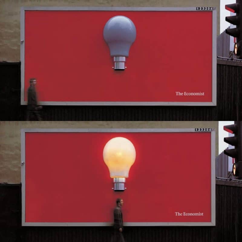
Much like the approach they take with their on-point articles, the billboard is clear, aesthetic and minimal. The built-in motion sensor that triggers the light-bulb whenever someone walks by is innovative and yet simple, suggesting that when reading The Economist, you’re instantly filled with bright ideas. This billboard is eye-catching for pedestrians and drivers alike, and it makes us want to run down and get the new Economist.
Honda
“Fit whatever” – it seems as if not much thought was given to this simple slogan, but on the other hand, so much thought was put into this. This slogan is exactly what it should be, and it tells you everything you need to know, without saying much. You can fit in the car whatever you want, and yet it’s small and elegant, which means the car’s trunk is actually Mary Poppins’ magical bag, as it can contain twice its storage space.

While some people are looking for speed and others are looking for safety when purchasing a new car, Honda chose to market their new car for its prominent benefit – the storage space. With this giant funnel filled with random junk (like we all have in our car), that’s being spilled into the trunk of this surprisingly small car. You can fit whatever you want in there #fitwhatever.
Coca Cola
What’s a better way to market a product than letting people try it out? Coca Cola is saying – taste our new, zero-sugar product, and see for yourselves how good it is. Since Coca Cola started its way over a century ago, they’ve always excelled at the field of marketing; and don’t we all know by now that good marketing is the key for success, no matter what the product you’re selling?
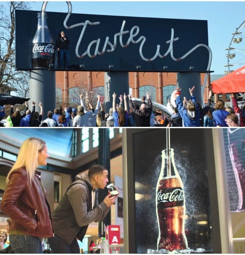
Over the years, they’ve had hundreds of different slogans worldwide (yes, that many, we checked), which all revolve around the idea of life, enjoying life, taste, tasting life and enjoying life to the fullest. Basically, they’re selling the idea that life without Coca Cola are a tasteless life, or life without enjoyment – and it seems to be working.
Denver Museum of Nature & Science
As we’ve already seen, some messages can’t be expressed with only one billboard, and in this case, the Denver Museum of Nature & Science needed three billboards to create the idea of unwrapping a chocolate bar in anticipation of what’s written under the wrappers.
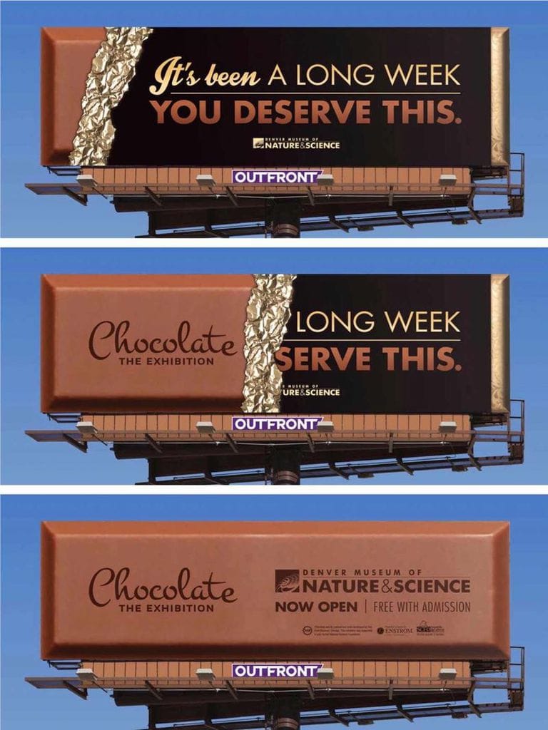
Using chocolate is also a brilliant strategy, since everyone loves chocolate. We’re all familiar with this feeling they’re trying to describe, that after a long day we deserve something sweet and comforting. Advertising a chocolate exhibition with a billboard-size chocolate bar (or three of them) seems obvious, but it’s creative nonetheless, and it sure makes us wonder about this exhibition.
BBC’s Dracula
When a new T.V. show or film comes out to theaters, it’s important to create public anticipation and let people know something big is coming. BBC found a very creative way of marketing their new show, Dracula: using natural light and shadows, they created a portrait of the intimidating vampire that only appears at nightfall.

What’s so brilliant about this, besides the fact that it’s never been done before (as far as we know), is that it fits perfectly with the story line of the vampires, and other monsters, who strike at night. As the sun goes down, the lurking creatures slowly appear, much like this shadow of the vampire, which is created by the bloody stakes.
Mondo Pasta
In this case, the photo of the person slurping the pasta, or the rope, is also strong enough to stand on its own, but what makes this an even more successful advertisement is the text – “so good you can’t let go.” This creates the idea that the person simply cannot let go of the pasta, and so the ship won’t be able to sail. I don’t know about you, but I bought it.

Publishing ads for pasta at the harbor might seem like an odd choice, but Mondo, the German company, knows what they’re doing. They spread several of these signs around the Hamburg harbor, which is one of the biggest, and busiest, harbors around Europe, ensuring that thousands of people see their ads on a daily basis.
Kill Bill 2
I wonder if the owners of the parked cars approved of this, or perhaps these cars were put there by the marketing team as part of the advertisement, to make it look more believable. The Kill Bill production company went a long way to market this film properly, even though I doubt any Quentin Tarantino film requires any marketing at all.

Considering this is the sequence of the first Kill Bill – which was a major box office hit – it was probably much-anticipated before its release to theaters. The advertisers, then, were asking to remind people of the first film and what was coming, and stir their anticipation.
Nationwide Insurance
We’re all familiar with those ads where we’re not sure what they’re trying to sell unless we look very closely. At first glance, this seems like an ad for paint, but upon close inspection, we realized this billboard is advertising Nationwide Insurance. When advertisements become works of art, you know they’ve done something right (or wrong, depends how you look at it).

It’s funny that this billboard, which is literally dripping with creativity, advertises insurance – perhaps the most boring thing imaginable, but on the other hand – it makes sense. Insurance is a tricky thing to advertise, first since it isn’t palpable, but abstract – you can’t feel, taste or smell it – and also because it’s insurance – something no one likes to deal with or even think about. That’s why insurance companies have to get extra creative in order to stand out.
Perlodent
We like the idea behind this advertisement, saying that if you use Perlodent, your teeth will be strong enough to open glass bottles, but we’re not sure that using this advertisement to open bottles of Coca Cola and other sugary drinks is appropriate for the message they’re trying to promote.

Perlodent might be good for strong teeth, but Coca Cola surely isn’t. Then again, perhaps it was put there on purpose, with this idea in mind: if you’re going to drink Coca Cola anyway, you might as well use Perlodent, to try and make up for that. In this case, this is one of the most extraordinary signs we’ve on this list.
Oldtimer
They’re not joking when they say “all you can eat,” huh? We’ve all had our stomach gurgle after hours of driving, waiting to for the next rest stop, only to miss the exit and fantasize about our meal for another several miles. Oldtimer has found a way to ensure no one ever misses the exit for their restaurant, with this tunnel that was creatively turned into a woman’s mouth.
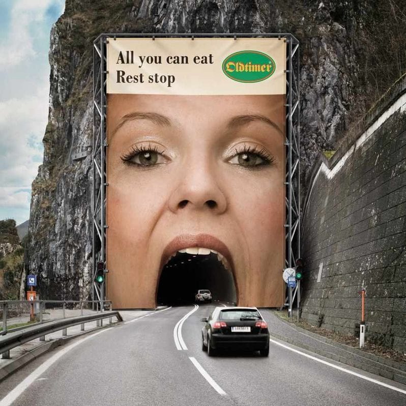
Once you enter this tunnel, the only way out is by stopping for a burger at Oldtimer’s, there’s just no way around it. Using the shape of the tunnel for their advertisement is a smart move, and it ensures no driver ever misses their sign, since they’re not just driving by it, but driving right through it.
McDonald’s
While McDonald’s are most widely known for their burgers and french fries, they also serve breakfast. In order to let people know they are open for breakfast as well, they turned this street lamp into a pot of coffee, spilling into a human-sized cup you can’t help but notice.
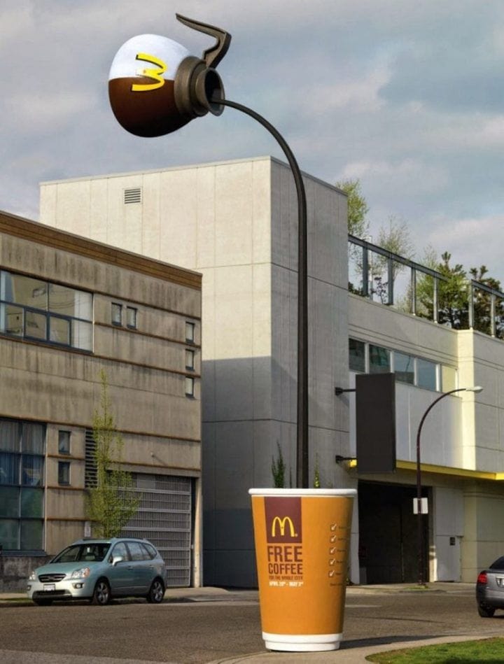
Turning the lamp post into a giant billboard makes it look very natural in its surrounding, as if it’s perfectly normal that at the end of this lamp post, instead of a street lamp, there’s a coffee pot. We’re not sure this is what’s going to make us have our breakfasts at McDonald’s from now on, but we sure appreciate the cleverness of it.
Calvin Klein
There’s nothing particularly creative about advertising women’s lingerie with a woman wearing those lingerie, and yet Calvin Klein refused to do the same old thing for the hundredth time, and they came up with a creative way to advertise the product the good old way – which is proved to work – while adding an interesting, innovative twist.
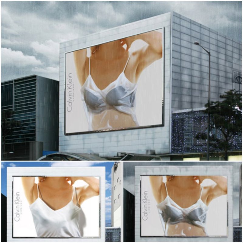
On sunny days, it looks like another photo of a woman wearing a slipper gown – the one we’re used to seeing on billboards from the dawn of time, but when it rains, the water-sensitive billboard – just like a real slipper gown – gets soaked and turns transparent, revealing the Calvin Klein lingerie underneath.
Apple
This reminds us of the Honda billboard with the funnel pouring into the car all the random junk that seems too much for the car to store. How could such a small item store in it all this content? All the music you can think of can be found in this little thing called iPod. Magical, I know.
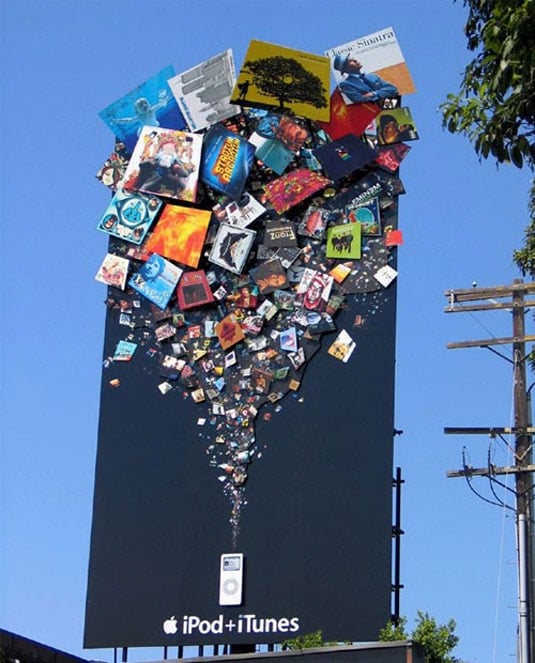
That’s what Apple was going for with the billboard, and you’d expect an innovative company such as Apple, who takes pride in its innovative and elegant ideas and designs, to have an innovative and elegant advertisement.
The Day After Tomorrow movie
Can you think of a better way to advertise an apocalyptic film? We can’t. We admit we haven’t seem the film yet (yes, we realize we’re sixteen years late), and thanks to this sign, we now have plans for the weekend. Unlike us, you probably saw the film – it portrays an apocalyptic scenario where the world comes to an end by a nature disaster, and the billboard seems to be the after-effect of the film.

The idea behind it was probably to get you in the film’s atmosphere, and it certainly does. If this billboard wasn’t placed in the ocean, there would be nothing special about it. In itself, it’s a plain billboard announcing the name of the film and its release date. What’s creative about it its unusual placement.
Science World
It’s enough to say the word ‘diamonds’ and you’ve got people’s attention. The Science World Museum spreads billboards with little-known scientific facts to get people familiar with their operation. We think that diamonds are extremely rare, and that’s the reason why they’re so expensive, but Science World is here to share with us the truth about misconceptions and things we never knew.

Why do we even need this information? We don’t, but every once in a while it’s nice to see an informative advertisements and learn interesting facts. Science World has found a way to advertise their museum the best possible way – it’s not another tedious advertisement selling us a product using beautiful women, but they’re advertising their “product” while sharing little known facts and enriching us.
The Simpson’s movie
To be honest, if we didn’t know better, we’d think this was an ad for Dunkin’ Doughnuts or any other doughnut shop; Homer loves his doughnuts, and so it only makes sense to use him in an advertisement for doughnuts shops. This isn’t a billboard, but it goes to show that advertisements can step beyond the confines of signs and billboards and take on new, creative shapes.
While it’s a good advertisement in the sense that it’s very hard, not to say impossible, to ignore, and it certainly gets our attention, there’s something missing from it: it’s hard to tell what they’re trying to advertise, and that’s never good. The Simpson’s movie poster is there, posted on the side of the escalator, but while the giant doughnuts and the Homer face catches out attention, it’s very easy to miss this poster.
Colorado State Patrol
The Colorado State Patrol realized that if this method works for advertisers and companies, there’s no reason why it should’t work for them. While we’re used to seeing fast food, makeup or movies advertised on the side of the road, sometimes billboards are used for serious announcements.
We’ve all dreamed of having a convertible at one point or another, but not this way. This is the emotion the Colorado State Patrol was going for, and they did a great job, if you ask us. The bottom sign says it all, even if you can’t read what it says. Important messages and warnings are often advertised the same way – either facing you with a car accident or simply writing the message without any creativity. However, This billboard gets the message across without being boring or frightening.
McDonald’s
We haven’t had a McDonald’s ad for quite some time now, and we’ve missed them. Strangely, McDonald’s seem to have some very dramatic billboards – that is, for a fast food company. The fried made of light are incredibly innovative, but I’d say it creates a dramatic scene – look how high it gets.

Nonetheless, this was probably the impression they were attempting to achieve – you can’t miss this sign from miles away. Every time we think McDonald’s can’t get any better, we’re blown away by their creativity. Who comes up with this stuff? We’d like to meet them!
IBM
IBM has come up with simple, yet elegant solutions for everyday problems. Some of us don’t even feel like these things are missing, but once they’re there, we realize how much we needed them: the bench, the shed and the ramp for strollers or suitcases are all there to make our life just a little bit easier – which is exactly what IBM strives for.
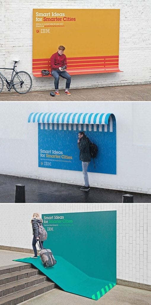
IBM isn’t even trying to sell anything here, except the idea that they’re here for you and they have the solutions you never knew you needed. They have smart ides and elegant ways of implementing them. This ad is subtle, on the one hand, since it’s not even an ad per se (they’re not selling a specific product), but on the other hand, it’s also very clear that IBM is trying to promote something.
FedEx Kinko
There’s nothing exciting about office products, and so marketing them might be a challenge. Good thing advertisers can recruit Guerilla Marketing strategies to their aid: Guerilla Marketing is a term that dates back to the eighties and refers to untraditional marketing methods, where the products interact with their environment and the customers in unconventional ways.
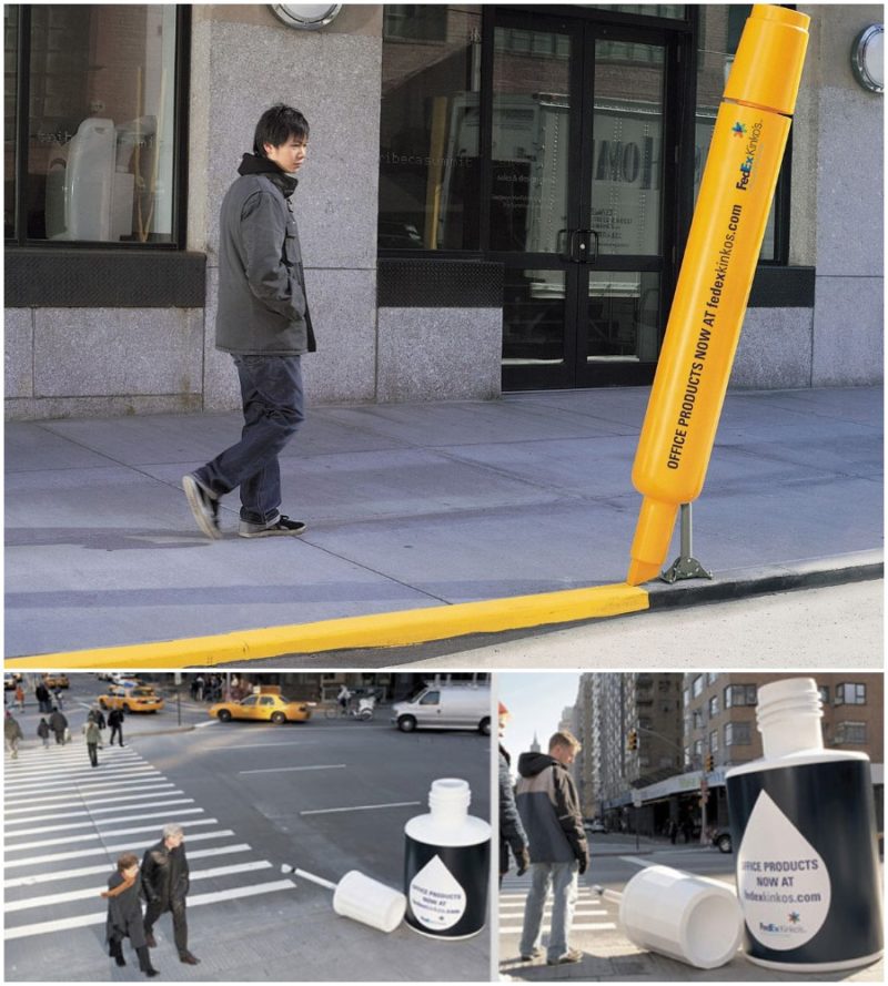
In this case, the over-sized marker paints the sidewalk yellow and the correcting-fluid paints the crosswalk with white lines. It is very creative indeed, but it’s pretty straight forward, so much so, it almost makes us think how come no one came up with this idea earlier.
Sun Chips
That’s the company’s way of letting the public know they are environmental and create their products using green energy. Their advertisement, like their product, is also made with the help of the sun, which sheds light on the billboard, reflecting the text.
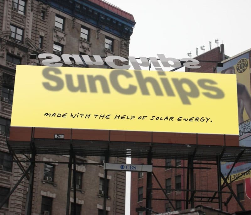
It’s not often that you see billboards advertising potato chips, since they either don’t require advertising, or simply because they don’t know what’s the right approach to advertise this product. SunChips came up with the perfect way, which is not obvious and boring, but still obvious enough to make you wonder who’s in charge of their marketing.
Hair Club
Balding is an issue a lot of men deal with, but nobody likes to talk about. It’s also not very pretty, and there’s nothing cool or intriguing about it, and so Hair Club had to find a creative way to advertise themselves. But how do you talk about an issue that nobody likes to talk about?
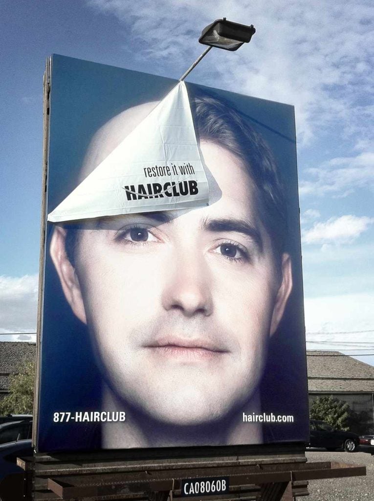
You don’t talk, you show. What’s brilliant about this ad is that they’re showing the person at the end of the progress, putting behind his old look, and only slightly revealing what he used to look like, only saying, “restore it” – short and to the point.
McDonald’s
This billboard is so simple, yet so sophisticated: in case you’re wondering how big the Big Mac is, there’s your answer – it’s too big to fit in the sign, or even two signs. This is only the tip of the iceberg for McDonald’s, who are huge in advertising. Every now and then, they come up with new, creative ideas for advertising their beloved product, which doesn’t even require that much publicity – it’s already one of the biggest burger chains in the U.S.
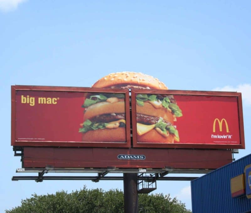
Nonetheless, they prove to the public every time that fast food isn’t the only thing they know how to do, but they also know something about advertising and creativity. This Big Mac, that’s literally bursting out of the billboard, is eye-catching for anyone who’s been on the road for some time and has developed an appetite.
Bloom
There’s almost nothing people hate more than false advertising, and that’s what makes Bloom’s billboard so convincing; their jumbo muffins really are jumbo. They could’ve just put a photo of their muffins, but it wouldn’t be as convincing, and the people over at Bloom know that as well as we do.
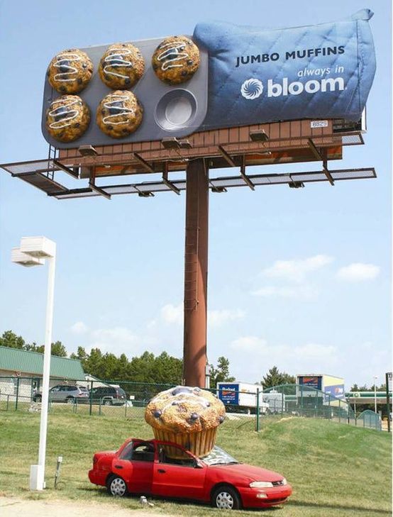
Those 3D, out-of-proportion muffins make it possible for us to smell the freshly baked goods all the way from here, and if we’re completely honest, it got us craving a blueberry muffin. What’s even more impressive about this sign, is that Bloom isn’t a bakery, as you might’ve probably guessed, but a grocery store. It’s nice to see how they went the extra mile to make this unconventional sign to attract customers.
Oskar Jensen
Oskar Jensen took advertising to the next level by taking it back, reminding us what advertising used to look like in the past, before the age of social media, where people offered rooms for rent on flyers hanging on trees and street lamps. This billboard is a nostalgic throwback to those times, only with a twist – posting a huge flyer you simply can’t ignore.
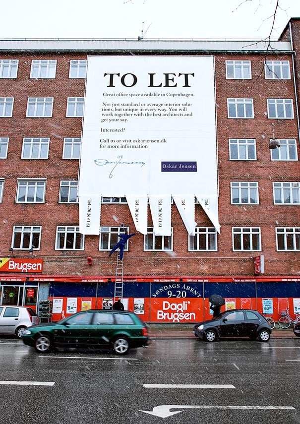
Their sign says “not just standard or average interior solutions,” and judging by the creativity of their advertisements, Oskar Jensen isn’t average or standard in any way. In its regular size, this format of advertising isn’t exactly eye-catching, since we’re used to seeing those signs everywhere we go. However, when it’s over-sized, it certainly catches your eye.
McDonald’s
McDonald’s have come up with yet another brilliant billboard, but they’ve got it wrong: as far as I know, you’re supposed to keep your eyes on the road. It is an eye-catching sign, though, and I might be partial, since I’m writing this before lunch, but it does stir my appetite, particularly for greasy fast food.
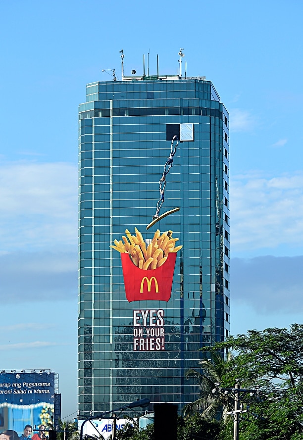
We have the large fries, which are enough on their own to distract any passers by, but what makes this ad even more successful is the chain dangling out of the window to steal some fries, since they just couldn’t resist the temptation any longer.
BIC Razor
We love the billboards that find a creative way to interact with their environment, and this is something we haven’t seen yet. Once again, the sign says nothing, but it simply shows you how strong the BIC razor is; although you’d never think of using it to cut grass, you should know that it’s strong enough to do so.
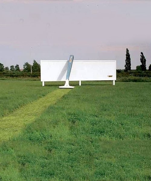
The only problem with this sign is that it’s quite high-maintenance – it requires the advertiser to cut the grass every other day, so as to not ruin the point. After all, if the grass isn’t cut properly, what does it say about the razor? Perhaps they never considered this, or perhaps they thought it was worth the trouble.
DHL
This billboard is literally what the phrase thinking outside the box means, mostly because it literally features a billboard coming out of a huge box. What DHL knows best is boxes, and so it’s only natural that they include a box in their marketing strategy. However, instead of putting a picture of boxes or a friendly delivery guy holding the boxes and smiling, they did this.

This an eye-catching billboard, because how often do you see a sign coming out of a box on the roadside? Thinking outside the box was always a key factor in advertising (that’s something we’ve learned from Mad Men), and the beauty of marketing is that there’s more than one right way to do things.
Lego
Much like the other Lego billboard, this one does the same thing – integrates with its surroundings, but unlike the other billboard, that portrays monsters as part of our world and encourages the use of imagination, this one shows you how lifelike Lego can be. It doesn’t sell you an image of endless options, but the idea that you can build your own world, which is just as realistic as our world.
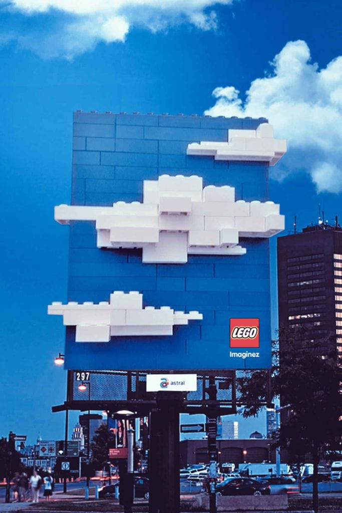
You might wonder what’s so brilliant about this sign, that only features a clear blue sky with white clouds, with not imagination whatsoever. The answer is right here: this sign is here to show you that with Lego, you can create beautiful things from simplicity. You don’t need sophistication and imagination (it’s great if you have them, but that’s besides the point), because Lego allows you to create something beautiful from simple pieces of lego.
Prestige Omega
Usually, companies that are trying to sell cooking equipment show you all the delicious foods you can cook using their products, as if buying these products would somehow magically turn you into a chef. Not Prestige Omega, however, who did the opposite by putting up an empty frying pan.
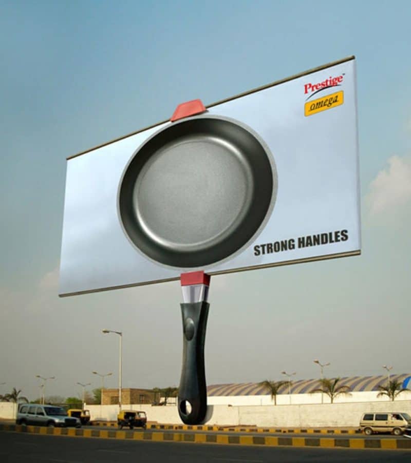
What they’re trying to sell here is not the image of how good your cooking will be if you use this pan, but rather they take on a new focus, and tell you how strong their handles are. If you think about it, it’s a brilliant marketing strategy (not only thanks to the unconventional billboard), but think about how frustrating it is when your pot or pan’s handles become unstable after using it only a few times.
Dutch Stutter Foundation
Advertising isn’t necessarily about trying to sell you products, but it can be used to promote important social messages. The Dutch Stutter Foundation have come up with a very creative way to raise awareness to stuttering, which is considered an affective disorder.
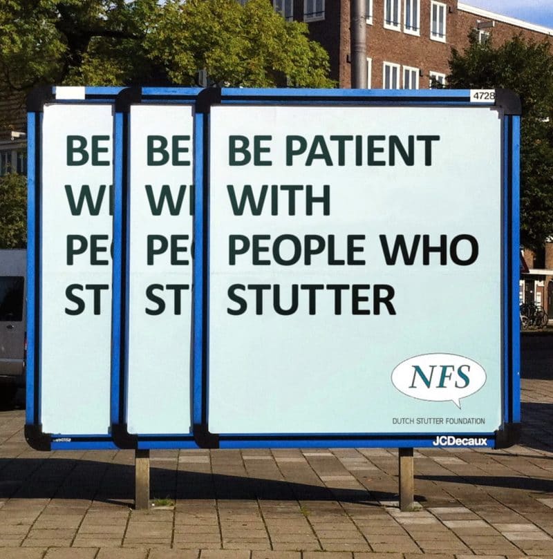
When it comes to advertising, people often walk by the billboards without giving them a second glance (unless there’s something eye-catching about them, as we’ve seen here), and they very rarely pause to read what the sign says. That’s why, with a sensitive, important message like this one, they had to take another approach and tried to be clever about it.
McDonald’s
This sign seems a bit too dramatic for McDonald’s, and we can almost hear a deep, dramatic voice saying “open at night.” However, perhaps this is the new approach they wanted to take to announce they were open at night – leave the silly image behind and get serious. After all, fast food at the middle of the night is serious business.
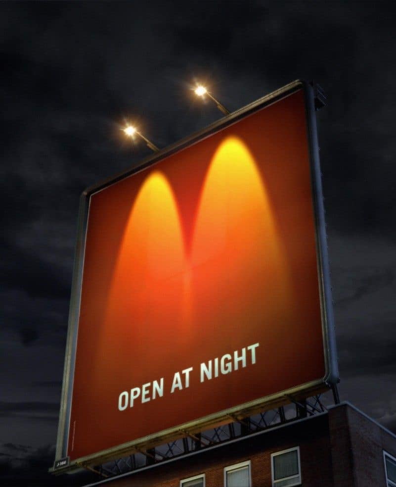
Using the two street lights to create the famous M is very simple, yet incredibly clever, and it gives a dramatic feeling; we’re not sure what it is, but something about this billboard seems as if they’re sending a Bat signal. If there’s one thing we’ve learned from this list, it’s that when it comes to advertising, minimalism works.
Royal Baking Powder
We’re no marketing experts, but if you ask us, cake is one of the easiest things you can sell (much like french fries, for that matter). All you need to do is show me a picture of a cake, and I’m sold. When the cake is the size of a building, it’s even better.

It’s so simple, and that’s what so brilliant about it: what better way is there to advertise baking powder than showing a giant layered cake? It looks like the upper right apartment didn’t approve of this advertisement (what’s not to approve of baking powder?) and weren’t willing to give up their apartment for this, but it actually worked for the best, since now it looks as if someone couldn’t resist the tempting cake and took a bite off it.
Cingular
The slogan “raising the bar” for a cellular service is brilliant, because it has the added meaning of signal bars. With this witty slogan, we expected them to have a creative billboard, but we did not expect this! The ‘calls’ literally dropped from the sign, reminding people why they hate dropped calls so much, just in case they forgot.
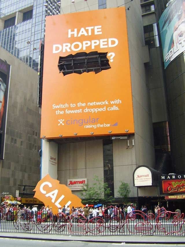
However, there’s only one thing we don’t get about this billboard: while we appreciate the idea behind it, we’re not sure the message is all that clear; if they’re trying to market themselves as the company with the fewest dropped calls, why did the call drop from their sign? That’s the opposite of what they’re trying to sell.
Coca Cola
McDonald’s probably takes first prize for the most creative billboards – there are awards for advertising companies, and the company responsible for their ads did win a lot of praise over the years, but that’s besides the point – but Coca Cola is certainly giving them a run for their money with their creative advertisements.
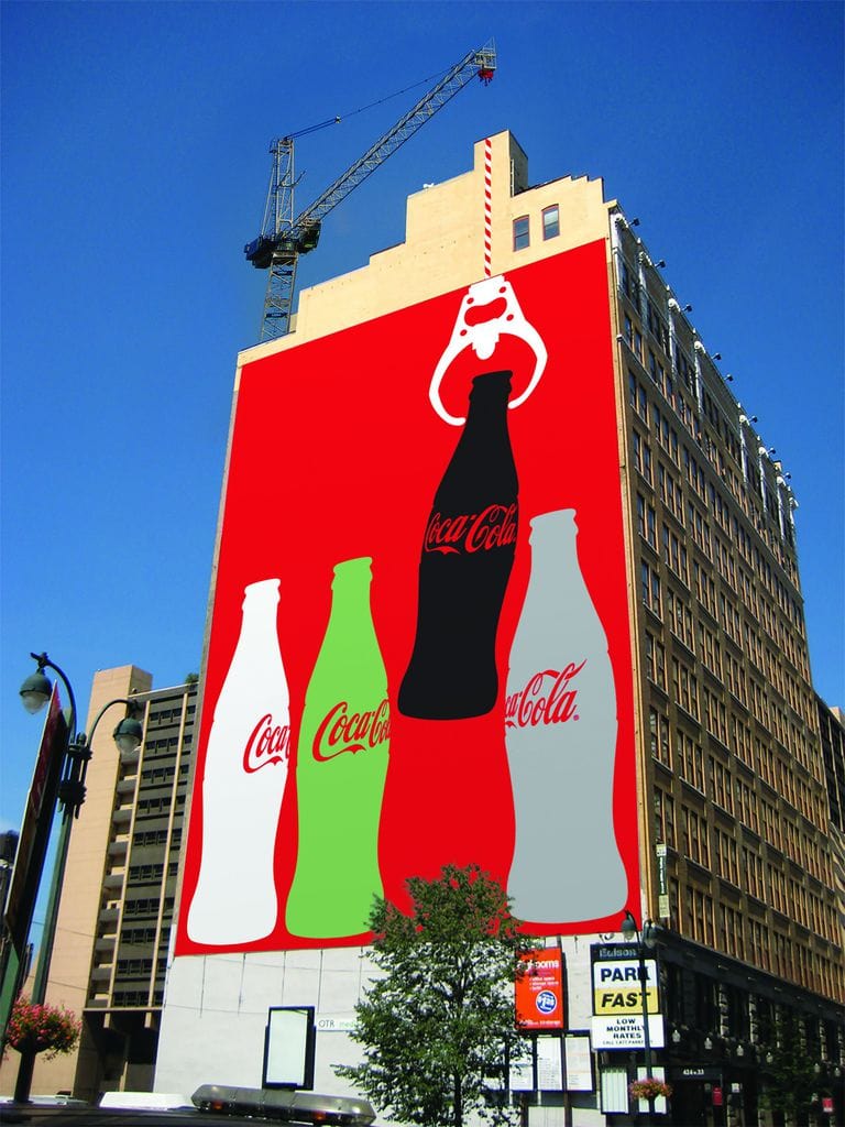
What makes this billboard special is how it interacts with the environment, as if the crane is pulling up the bottle. However, this can only work as long as the building is under construction, and when they finally finish it, they’ll have to find a new home for this billboard, since it won’t work as well on its own. For the time being, we think their creative team is doing a good job.
Axe
When Axe deodorant first hit the market, people were going nuts over the deodorant that smells like cologne, because, if we’re honest, there’s nothing men like better than having two birds. Its popularity never really subsided, and Axe is still a common choice of deodorant for men, but even products that are popular enough are ought to change their marketing strategy every now and then.

Upon first glance, we would never have guessed this was an ad for deodorant, but what they were probably going for is suggesting that if you use Axe, your calendar is bound to be packed with dates, since women can’t get enough of that smell. We’re not sure we approve of this message, but we appreciate their creativity – utilizing the building to make a huge calendar is something we’ve never seen before.
McDonald’s
What’s brilliant about this ad is that it puts McDonald’s iconic french fries in our subconsciousness. They don’t have to say anything, they don’t even have to put up a billboard – all they do is paint the street with french fries for a crosswalk. We can guarantee that every other person crossing the street on these french fries immediately thinks of their salty, addictive taste.

This is the last McDonald’s ad, we promise. What we like about this one is that advertisers once again found a way to prove that traditional advertising isn’t the only right way, and that good advertising, like anything else in life, comes in different shapes and sizes.